Challenge
How do you modernize a beloved 80 year old brand without losing the legacy look, feel and tone that has made Fletcher’s Corny Dogs one of the most famous brands in Texas?
Activation
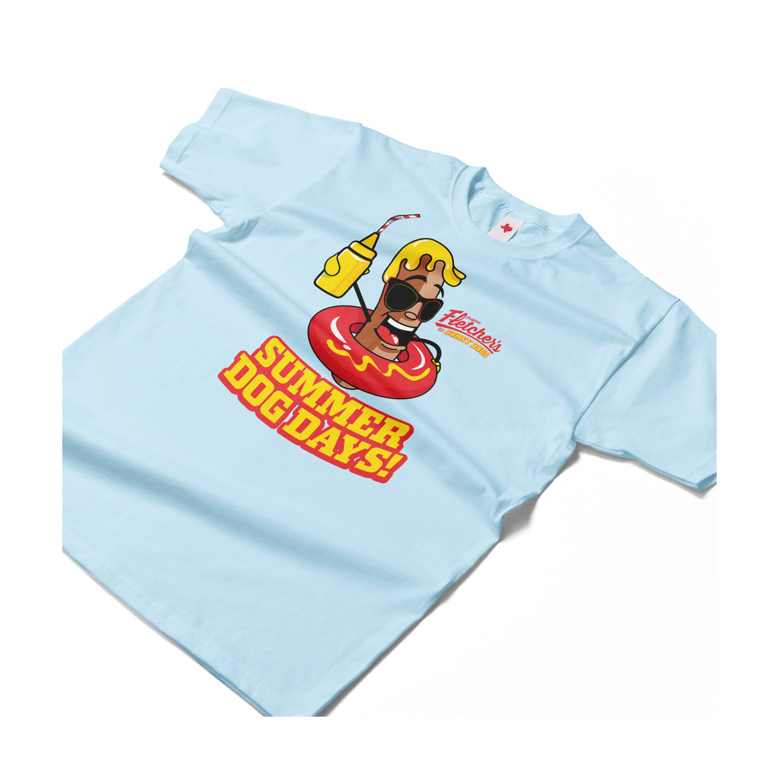
We worked closely with the Fletcher family and their legacy marks to subtly modernize the composition, letterforms and hierarchy of their primary “Original Fletcher’s Corny Dogs Since 1942” mark. Resulting in a mark that has more of a locked-up logo feel that can be utilized in more modern mediums, especially in the digital space. We then focused on Mr. Corny and worked to created a “hero” pose that lets Mr. Corny appear in multiple scenarios and outfits while retaining a consistent appearance. Updating Mr. Corny’s mustard topper, eyes/expression and giving him a brand new set of teeth, helped us modernize his appearance and open him up to mew possibilities.
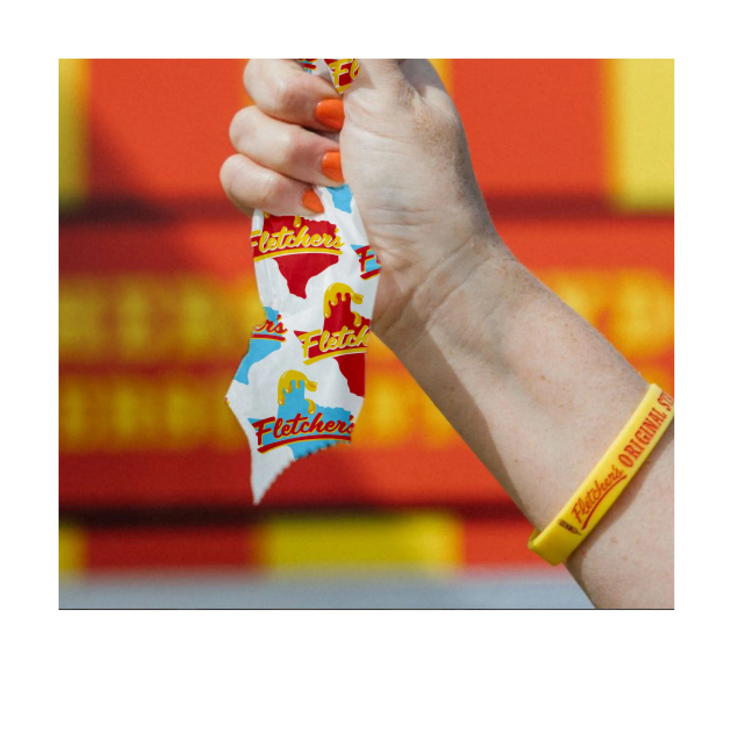
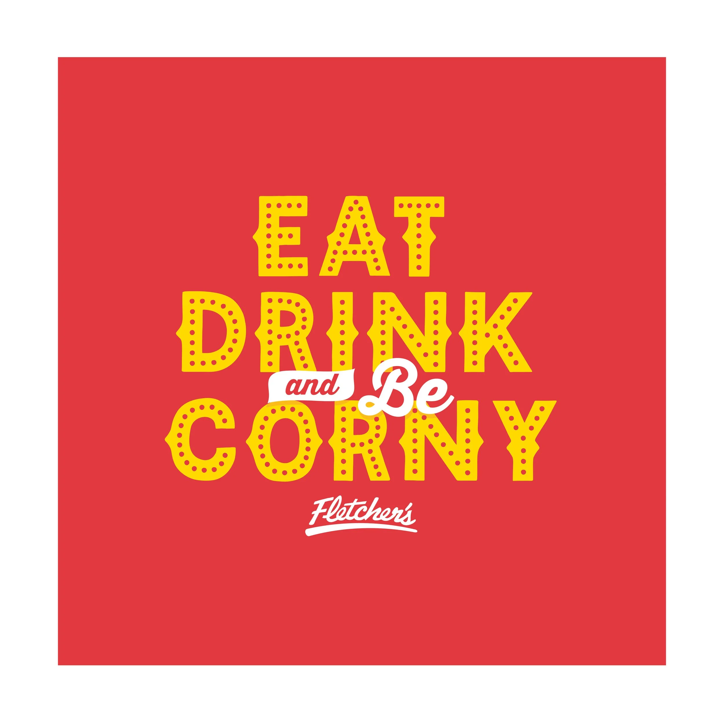
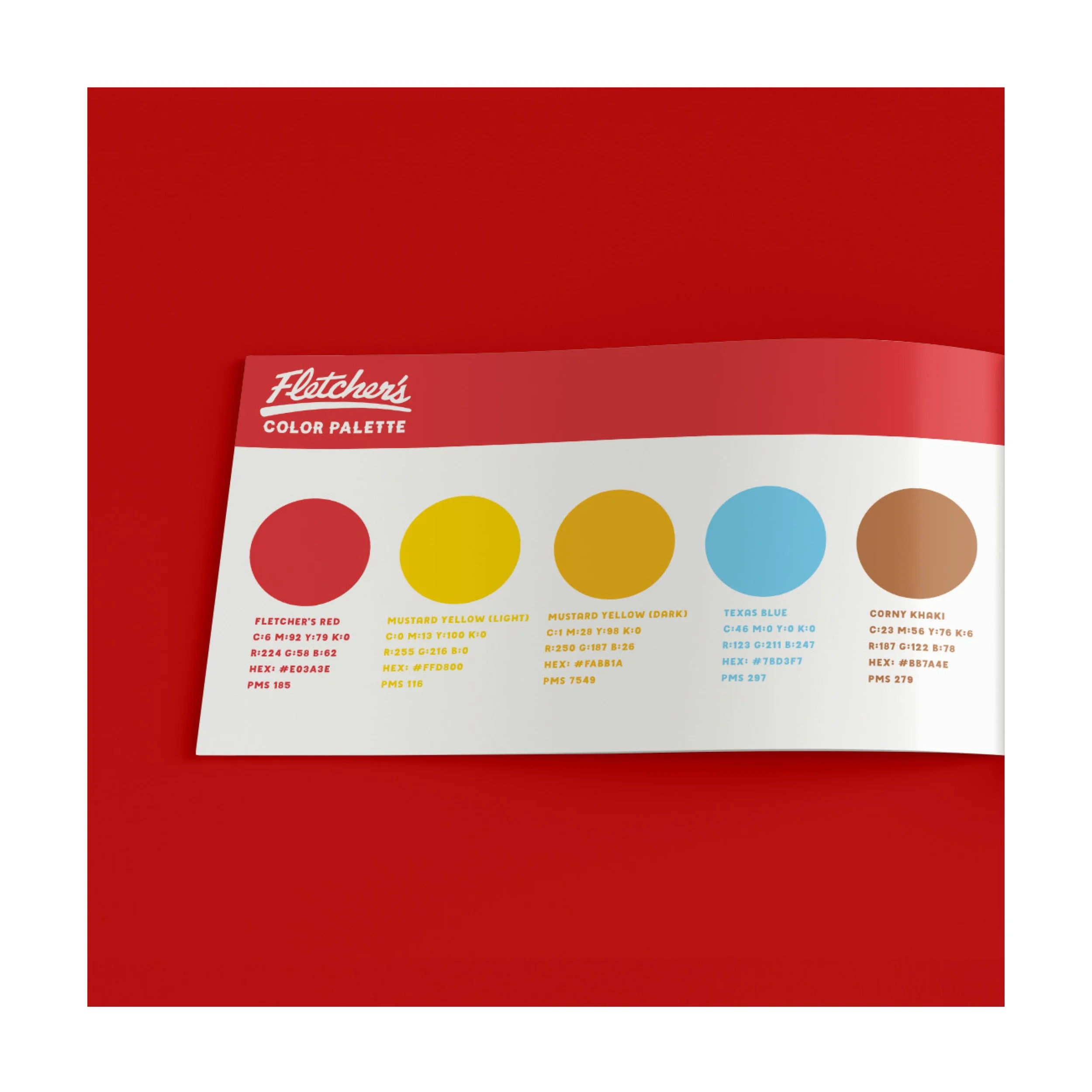
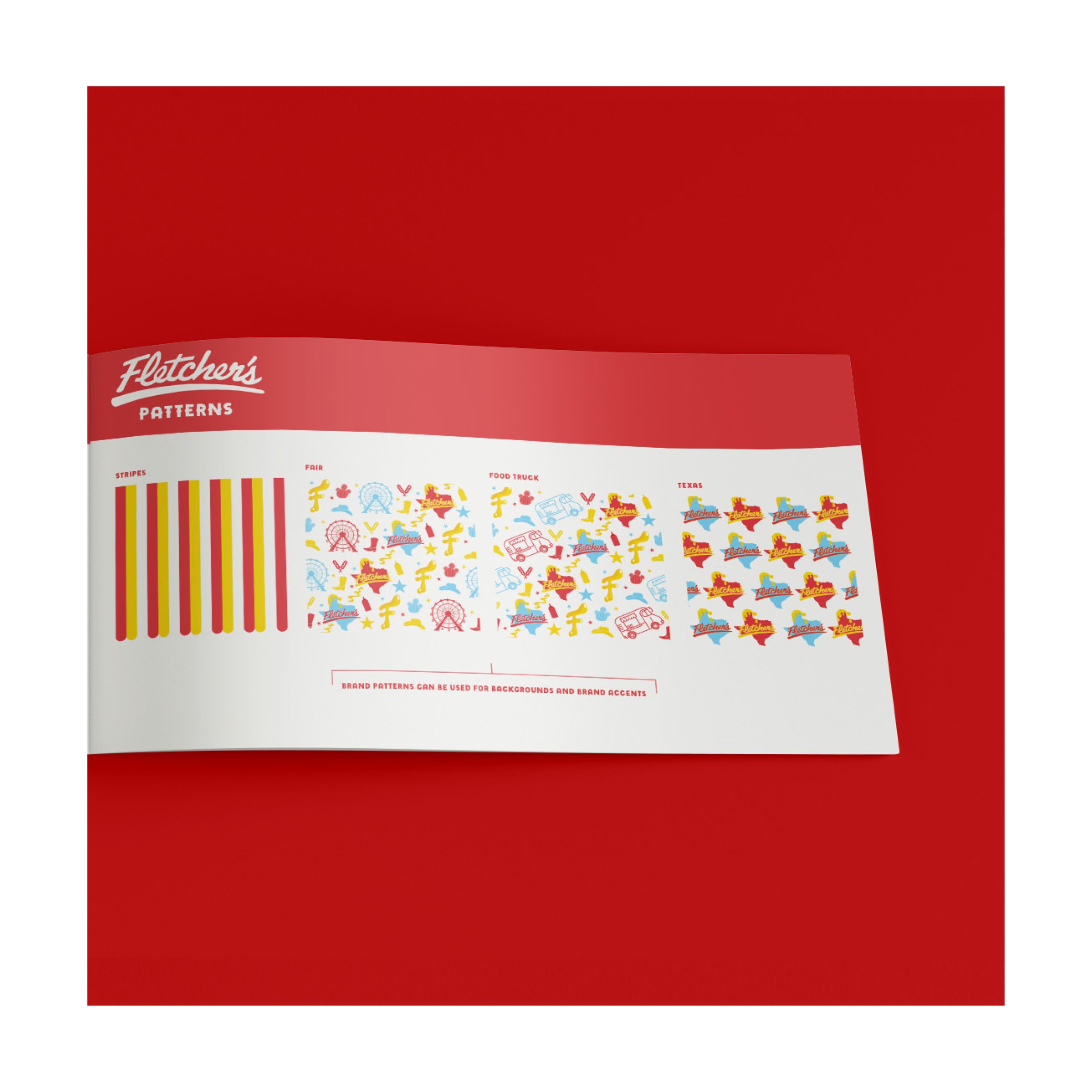
We next worked on a new typography system that retained the legacy western/carnival feel while using opening brand up to feel at home outside of the State Fair of Texas. And created a graphic type-style that gives some of the brand’s most famous quotes a new retail feel. Finally we added a mustard topper accent style and brand patterns to round out the rebrand.
The new brand rolled out during their 80th year at the State Fair and then debuted on the brand’s first permanent food truck location at Klyde Warren Park.
One of our agency’s longest and cherished traditions is taking a day off to go to the fair for a Fletcher’s Corny Dog, so it goes without being said that getting work on a brand that means so much to us was an honor.


